Thursday, March 28, 2024

Color and Quilts 4 - Borders and Binding

 Finishing color touches, the border(s) and binding.


Borders


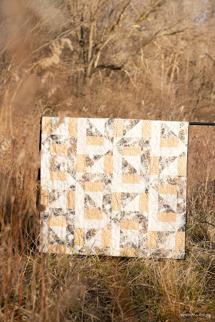
Diamond Run


I love a good border. There are a few of my patterns that don't have borders, but if I can add a border, or two, or three, I do it with joy.


Borders can give your eye a stopping point on a quilt that has a lot going on.


They can frame a gorgeous design, making it the center of attention.


Borders can add to the design of the quilt.


They are a great place to add that large print you fell in love with, but would not have worked well within the pattern, like we talked about last week.


Sometimes, the border fabric is picked before the rest of the fabrics, simply because it called your name.

How do you pick a good border?

1) First it's important to remember, just because a pattern does or does not call for a border, doesn't mean you have to do what it says. If you think your quilt top needs a border, or more than one, go for it. If your quilt top is telling you it doesn't want a border, skip the border.

2) If you are choosing a border based on fabric you have already chosen, lay it out across all of the fabrics. Even if the border won't be next to a certain fabric, it will be seen with it, so should compliment it.

3) Did you fall in love with a large (or small) print that you want to base your fabric colors off of? Just like the tip above, you want to lay those fabrics over the border fabric. You don't have to pull every color from that border, that could get very overwhelming, but the few you do should compliment it.

 
Binding

Binding is THE final touch for your quilt. The more confident I've gotten in myself as a quilter, the more stripey my bindings have gotten. 😂


Seriously, I love a good striped binding. So much so, I'm not a fabric collector, but I do buy striped fabric whenever I see one I love. Other than flamingo fabric, it's the one fabric I will buy without having a plan for it. Ok, I do the same with purple.

Before I fell in love with stripes though, I was a matchy, matchy girl with my binding, and for the most part I still am.


I have a hard time not matching the binding fabric to the border fabric. While I can play a bit with borders, I truly want a stopping point to my quilt, and feel binding is that stop.


When there isn't a border then I usually do a dark fabric to make sure it does stop the eye at the edge.


I have been know to switch it up a bit, though and use a bright fabric color pulled from the top. Just like the border fabric, you will find what you like, just be open to try different binding options. Sometimes a quilt will make you do something you don't usually do, and it makes you a better quilter. 💜

So how do you choose binding if the quilt isn't talking to you?

1) You can always use the same fabric you used for the border, for the binding. It will blend in nicely and you know it works with the quilt.

2) Pull a fabric that you used in the quilt. The teal binding I used on the Quilt Crush quilt  above was the same fabric I used in the center of the blocks. While it made the binding pop, it was a continuation of that fabric and so still brings your eye to a stop.

3) Go stripey! 😉 Seriously, a stripe or patterned binding can add a special, uniquely you touch to the end of your quilt. Find one that is tone on tone, two colors or multicolored. If you can find one that has the colors of your top in it, go for it.

4) If all else fails, go for a solid binding that is the darkest color in either the quilt top or the border. It will say this quilt is finished and that's just the way I like it.

Make something extraordinary!

Jen

Did you get my 5 Free Tips for Accurate Piecing yet? I would love to send it to you, sign up HERE!


New to Patterns By Jen?


Don't forget to sign up for the Bites of PBJ newsletter while you are here!


Newsletter sign up


2024 Monthly Color Challenge


Find paper and digital patterns in my Etsy shop


Find fun PBJ merchandise at Teespring


Follow me on Instagram


Join the Quilt and Learn with Patterns By Jen Facebook page.

Thursday, March 21, 2024

Color and Quilting 3 - Solids and Prints

Let's talk solids and prints in quilting.


The last two weeks I've shared ideas and tips for choosing colors for your quilts. You can read them HERE and HERE. This week I want to touch on using solids and prints and how they can also affect your color choice.

I have a couple of quilts that were made with questionable fabric print choices that I want to share with you. In these instances I was so focused on getting the color right, that I ignored that little nagging voice in my head that maybe the prints weren't quite right.

It's so easy to do when choosing fabrics. When I go in with a specific color combination in mind, I am truly focused on just that, the color and not how the prints in those colors play together.


This was very true when I was choosing the fabrics for Square Illusions.
I love the colors I chose for the quilt, but the prints within the colors definitely detracted from the design, especially because they were also multicolored. I totally lost the illusion of multiple squares because of the prints in the chosen fabrics.


You can see what the PBJ testers did with their fabric choices in THIS POST and how prints were used, and used successfully in their Square Illusions quilts.


I found the same thing happened in this version of the Friendly Flight quilt. I was determined to have a blue and cream quilt, and focussed solely on getting the right hues and values of the blues, and not what the prints were going to do to is as a whole. In this instance I should have looked for more solid looking prints (i.e. blue on blue) more than mixed prints, as well as smaller motifs.


For the second version of Friendly Flight, I still used fabrics with patterns in them, but they were used more purposefully and with the overall design in mind.


How do we avoid this? Some people are just born with an eye for this type of process, I am not those people, which is why I tend to use fabrics that have prints that are color on color. Like white on white, etc. I do have a couple of tips to share, though.

1) When shopping for a specific pattern, make sure you know the size of the units you will be making. Are the HST (half-square triangles) going to finish at 2" or 4"? What size is the finished square, 12" or 16"? When you know what sizes you will be working with, you can go into the store and measure the print. Maybe even have a piece of paper cut to the size you will be making so you can see how it looks next to the print size. Some of the larger prints might surprise you, they have obviously surprised me a time or two.

2) When you begin pulling fabrics, start with solid reading fabrics first, then add in or replace the solid fabrics with prints. This can help you pull in prints that add to the overall feel of the fabrics, instead of overwhelming you with all of the beautiful prints.


3) If prints make you nervous, but you want more than solids, look for solids with texture. These can help give a gentle movement to your fabric choices, but still help build your color and print confidence. I do this for my Monthly Color Challenge.


One year I did a completely solid quilt top, but I usually choose fabrics like Benartex's basic lines Cotton Shot or Burlap, because while they are solids, they have great texture to add an extra oomph to your block, and in turn, your quilt.


4) Take a photo of your fabric choices (ask permission first) and change the photo to greyscale or black and white. This is a trick I often use to check that my values are correct, but it can also give you an idea of how the prints play together.


Lastly, it will take some practice to develop an eye for choosing prints, so just as I suggest asking your LQS (Local Quilt Shop) owner/employees for help with color choices, ask for tips/help with prints as well. They tend to have a good eye for color, and they want your quilt to beautiful, too.


Do you have any tips for choosing prints for a quilt top? Share them in the comments!

Make something Extraordinary!

Jen

Did you get my 5 Free Tips for Accurate Piecing yet? I would love to send it to you, sign up HERE!


New to Patterns By Jen?


Don't forget to sign up for the Bites of PBJ newsletter while you are here!


Newsletter sign up


2024 Monthly Color Challenge


Find paper and digital patterns in my Etsy shop


Find fun PBJ merchandise at Teespring


Follow me on Instagram


Join the Quilt and Learn with Patterns By Jen Facebook page.

Thursday, March 14, 2024

Color and Quilting 2

 Let's take another look at color.


Affiliate Disclosure: This post contains Affiliate Links. When purchases are made through these links I receive a small commission at no extra cost to you. Your purchases help support my small business and keep my husband's head from exploding every time a new quilting notion arrives in our mailbox. Thank you for that. Find out more about Affiliate Links Here.

Last week I shared a couple of tips for picking colors for your quilts. What did you think of My Color tool? I love that it gives you pallets of all kinds to go with the one color you chose. So. Many. Color. Options.

This week I am going to talk about using the different parts of the Color Wheel and how it looks in quilting. Please note. I am NOT a color expert. What I am sharing is just what I have done with my color choices.

For this post I'm using the Color Wheel below. It's my favorite of the two.


Color Wheel Set


Complimentary colors are colors that are opposite of each other on the color wheel.


These combinations can really make a pattern pop. I like to draw my patterns on graph paper, then put them into EQ8 (Electric Quilt 8) and color them. I usually put colors in that are complimentary, because they really make it easy to see how the pattern comes together.


In this instance though, it ended up being the color combination I chose for the front cover photo for Gradient Stars. I love it to this day.


Monochromatic colors use one base color and then use different tints and shades of that color. Shades are what you get when you add black to a color. Tints are made from adding white. Note, this photo shows both the complimentary and the monochromatic color options.


This could be an instance where you get to use your favorite color throughout a quilt. This is the monochromatic version of Gradient Stars.


This pattern was released a few years ago and I love how it shows what color can do in one pattern.

Analogous colors are three right next to each other. (Note, this photo shows the Analogous colors; green, yellow and mustard with a complimentary color.


While you may not think analogous colors are something you would work with, I ended up doing so accidentally, they can really work well together. I think they make this modern log cabin pattern, Fall Retreat, pop.


The Foolproof Color Wheel set also shows you the Triadic colors, three colors equidistant from each other on the color wheel.


As well as the Tetradic, four colors equidistant from each other on the color wheel.


With a few bonus wheels as well.


If you would like more help finding color pallets, I just found the Canva Color wheel. This lets you put in one color and then you choose if you want Complimentary, Monochromatic, Analogous, Triadic or Tetradic combinations.

So many color options, so little time!

Go make something extraordinary!

Jen


Did you get my 5 Free Tips for Accurate Piecing yet? I would love to send it to you, sign up HERE!


New to Patterns By Jen?


Don't forget to sign up for the Bites of PBJ newsletter while you are here!


Newsletter sign up


2024 Monthly Color Challenge


Find paper and digital patterns in my Etsy shop


Find fun PBJ merchandise at Teespring


Follow me on Instagram


Join the Quilt and Learn with Patterns By Jen Facebook page.

Thursday, March 7, 2024

Color And Quilting

 Quilting and color, a topic that can cause anxiety with new quilters.


Confession, it causes anxiety in me as well! I have pulled fabrics for a quilt thinking that they would work well together, only to find that they most definitely did not.


Affiliate Disclosure: This post contains Affiliate Links. When purchases are made through these links I receive a small commission at no extra cost to you. Your purchases help support my small business and keep my husband's head from exploding every time a new quilting notion arrives in our mailbox. Thank you for that. Find out more about Affiliate Links Here.


Have you ever asked these questions:

How do I get the right colors from such an array of choices? How do I know what will work together and what won't? How do I keep the pattern from disappearing when choosing colors? What if I don't want to go down the rabbit hole of learning color theory and strategy (which I think is a good hole to go down when you have the time) and I just need to get this baby/wedding/birthday/graduation quilt done?

There are a few tools that you can use to help you pick out your colors.

1) You can buy kits. While they may seem expensive, you will most likely spend the same amount of money when choosing your own colors, if not more if the colors don't work well together in the end.

2) If you have a Local Quilt Shop (LQS) I highly recommend building a relationship with the owners/employees. They usually have a great eye for color.

3) You can buy fabric bundles.

4) You can use the reliable color wheel. I have these:


Color Wheel Set


Color Harmony Wheel

5) If you use Pinterest you can make a board for Color Inspiration. You can see mine HERE.

6) I found this online tool that let's you put in the color you want to use and then it will generate a color pallet for you! Find it at mycolor.space Don't worry that it asks for the HEX code (the 6 [or more] numbers given to colors), if you click on that button you will be able to pick your color.


I think part of the reason color is so difficult is that, not only are we are surrounded by color, but color can also evoke strong emotions within us. We are pulled towards some colors and pushed away by others. So while we may want the instant gratification of an easy answer (raising my own hand high here), I would definitely encourage quilters to do some color learning. You can find so many YouTube videos out there that do teach color theory and the art of choosing colors. I also found that Domestica has a page with links to seven free color theory tutorials. You can find that HERE.

What have you found to be helpful when choosing colors for your quilts? Share below, I'd love to learn with you!

Go make something extraordinary!

Jen

Did you get my 5 Free Tips for Accurate Piecing yet? I would love to send it to you, sign up HERE!


New to Patterns By Jen?


Don't forget to sign up for the Bites of PBJ newsletter while you are here!


Newsletter sign up


2024 Monthly Color Challenge


Find paper and digital patterns in my Etsy shop


Find fun PBJ merchandise at Teespring


Follow me on Instagram


Join the Quilt and Learn with Patterns By Jen Facebook page.

Friday, March 1, 2024

2024 March Monthly Color Challenge Block

 Did you need that extra day in February for the Monthly Color Challenge? I was definitely in need of an "extra" day.


Our challenge this month is inspired by tropical fish. Such beauty lays under the water, it's hard not to be inspired.


Photo Credit to Modest Fish


This month our color is red and we look to the Cherry Barb for our inspiration.


From Modest FishCherry Barbs get their name from their vivid red coloring covering their whole body. A peaceful schooling fish, when housed with others like neon tetra and rasboras, it can make for a picturesque community tank.


I love the red of this fish. I bet seeing a flash of red in your tank would be so pretty.


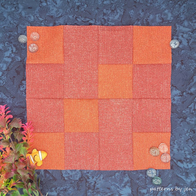
I'm using Benartex's "Burlap" fabric line. I love the texture of the fabric, sooo much.


Our featured blogger this month is:

Marlene of KiSSed Quilts

Find her on Instagram


Ready for the  block? It's another super simple block that uses 4-patch units.


Join the Quilt and Learn with Patterns By Jen Facebook group (make sure to answer the questions so I know you are a real person ðŸ˜‰) where you will get a lot of support and questions answered! If you aren't on Facebook you can also follow Patterns By Jen on Instagram. Use #2024MonthlyColorChallenge when sharing so I can be sure to see your block.


I hope my feed is swimming in red this month!

Ready to get the pattern? Go to Payhip and download it now! The block is free for the month of March! Each set of instructions includes a "How To" video.

It's too late to receive the January through March block instructions through email, but you can still sign up to have the April - December Monthly Color Challenge blocks (and the layout!) sent directly to your inbox. Sign up HERE.


Let's make something Extraordinary!


Jen


New to Patterns By Jen?


Don't forget to sign up for the Bites of PBJ newsletter while you are here for early releases and sales just for subscribers!


Newsletter sign up


2024 Monthly Color Challenge


Find paper and digital patterns in my Etsy shop


Find fun PBJ merchandise at Teespring


Follow me on Instagram


Join the Quilt and Learn with Patterns By Jen Facebook page.